Categories
Development

Opening Links in System Browser with Cordova 2.4.0 (PhoneGap)

Found myself a little stumped on this one. I’m making a simple directory mobile app using PhoneGap for iOS and Android. The listings have a website associated with them that we want to link to from the mobile app.

However, when I tested it on my iPhone I discovered that all the links were opening up within the app iteslf. Meaning that user was now trapped in that site with no way back to the Mobile App. Not a very usable experience (though the business clicked on in this case may’ve liked that).

So I tried many things, target=”_blank” seemed to be recommended. Apparently that worked on older versions of Cordova. But, not in my case.

After some more research I did find some documentation on how to handle the InAppBrowser. Finally, exactly what I was looking for!

Apparently you have to use the window.open() function and set the target to _system.

window.open('http://a-website.com', '_system');

So, I updated my links and all seems to be well now!


Categories
Development

Indulge in Avalon mobile website

I’ve been working on a mobile website for the great folks at Indulge in Avalon. A few months back we had just launched a site for them powered by Joomla!, and since we had a solid foundation built it really made a mobile version much easier to develop.

The first step was figuring out what type of mobile experience to offer. Google Analytics really helped us out here. We were able to get a good idea of what type of mobile devices have been visiting the site, browser types, etc. – amazing info! Due to visitor information and features needed, we decided to go with a mobile website vs developing a mobile application(s) at this time.

Next was simplifying the experience for the mobile user. This site primary features local businesses of Avalon, so we wanted to really focus on that and make it as easy as possible for a mobile user to navigate. A simple iOS like list navigation really worked well for the data we were delivering. A user could easily drill down for details and back up again.

Then we worked of speed, speed and speed. The mobile website makes use of no images in it’s interface, it’s all CSS driven and if you have a really spiffy device takes advantage of gradients and rounded corners, etc. If you don’t have a super new device, it’s still attractive and fully functional. Minimal use of http requests and minified code is used as well to squeeze every little byte out of the site. All this savings really makes for a fast site, even on slower connections.

All in all this has been a very great experience. The clients being so easy and understanding to work with really help in making this work as well as it does. They know what they want, deliver their parts and are open to my suggestions on the areas of expertise. There’s still some minor areas to finish up and optimize even further, but please feel free to check out the mobile site by either visiting www.indulgeinavalon.com in  your mobile device or you can access the mobile site directly at m.indulgeinavalon.com
Categories
Development

Simple Mobile Detection Redirect

Been working on a simple mobile version of a website I’d done for a client in the past recently. We can a user on most popular mobile devices to be automatically redirected to the mobile version of the site when they visit the main website.

So I went way back to some User-Agent sniffing to accomplish this. I thought I was done with the whole User-Agent redirecting different versions of site’s, but in this case it does work really well.

Just collect the User-Agent header using PHP there run it against a switch statement for each mobile device we’re checking against.

Just look for an instance of a device specific string using preg_match() in PHP.

iPod/iPhone and Android example:

case (preg_match('/ipod/i', $user_agent) || preg_match('/iphone/i', $user_agent));
        header('Location: ' . $redirect);
	exit;
break;
 
case (preg_match('/android/i', $user_agent));
        header('Location: ' . $redirect);
	exit;
break;
Categories
Books

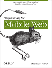
Programming the Mobile Web

Programming the Mobile WebIt’s still tough finding good sources of information when developing for the mobile web. I’ve found amazing resources if you’re developing native applications, but when developing mobile friendly sites it’s a different story.

Been reading Programming the Mobile Web and even though I still have a few chapters to go, must say that it’s a must own if you’re a web developer who is interested in making your site mobile friendly or even developing a mobile version of your site.

The book does a great job covering all the different platforms and browsers to account for (it’s so crazy how many there are) as well as best practices to handle all the variety out there. Even if you have a good understanding of developing for the mobile, I’m sure you’ll find a few useful tips along the way.

An excellent resource that I’m sure I’ll be opening up many times again long after I’m done reading through it.