Categories
application Design Development Projects website

Degree Chooser

Areas of Study screenshot

We made a pretty slick degree chooser at work. Ours is labeled as Areas of Study, but ultimately we made an easier way for our visitors to sift through what degree(s) might appeal to them.

Live example:

https://stockton.edu/academic-affairs/academic-schools-programs.html

There’s a lot going on under the hood with this one, and we’ve utilized what I think are some pretty cool techniques to make it not only easy to use but also easy for our content managers to keep up to date.

Our CMS (content management system) is OU Campus which specializes in higher ed. They’re great for us. Their templating system relies on XML/XSLT (not always so great), so ultimately a content manager typically is editing an XML file on the staging server that is then transformed into an HTML file that live on the production server for visitors to see.

So to make editing as seamless as possible, we setup a table is OU Campus that our content manager can edit, just like any regular page. Just what they’re comfortable doing day in and day out. We then leverage some XSLT magic (there are parts of it that I still believe to be magic even though I wrote it) to transform the content managers edits. Here’s what’s happening when they edit:

  1. Content manager makes normal edits to a html table with columns, rows, etc. Each degree is a new row in the table.
  2. On publish the XSLT transforms the edited XML into 2 files. A standard HTML page of the table transform and grouped by degree type.
    1. This is the most basic but functional version of the page. It’s served up like this to meet any visitors who may be visiting with the most ancient of browsers. They will still at minimum get a fully functioning list of linked degrees.
    2. The table is also transformed via another XSLT file to a JSON file. This JSON file will serve as our data source of areas of study. The external JSON file makes it easier to use the data in other pages/applications too!
  3. So now we have 2 files. The HTML page which is fully functional, yet a tad boring and a JSON file just waiting to be used.

Next we used Vue to write the JavaScript for this little app. I found Vue to be pretty lightweight and translates well to our CMS and the talents of our team. It’s my current favorite way to code up JS projects.

We didn’t use the vue-cli, just some vanilla Vue for this one. If we do a 2.0 we’ll probably go with vue-cli as we have a much better understanding of it now and it’s benefits.

Vue

4. The Vue script not only filters by title, school, etc. but we also include a field for tags. This really opens the door for us to make sure that our degrees can be found not only on their proper name, but perhaps a name that is used at other institutions, or even if searched as a career driven term. This should be a big upgrade for all.

5. To top it off we collect Events in Google Analytics of terms searched on. This data will help us make sure that the tags being used make sense and if we should consider adding new tags or even renaming or launching new degrees in the future.

All in all a very fun project that really helps to modernize a highly used page on our site. We’re looking to incorporate the JSON data into other apps/uses as well.

Here’s the repository on GitHub:
https://github.com/joedag32/areas-of-study-app

Categories
Development website

Sea Isle City Website and Mobile Apps

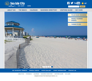
Sea Isle CityJust wrapping up some work for Sea Isle City on a new website and some mobile apps as well. The website is www.visitsicnj.com and the mobile apps are available for iOS and Android.

This was a rather large project, and working with the folks at 7 Mile Times was a pleasure yet again. They are extremely organized and great to work worth.

Kim provided an excellent design to build upon and Patty was fantastic is organizing content and keeping things rolling along. It was pretty great.

We built the site on a very stable CMS that made it very easy for the admins to manage the site. Training them literally took minutes if that, given the simplicity of the CMS.

The calendar presented some interesting issues. They wanted the events grouped into months, and working with dates/events can always be a challenge. After much trial an error a solution was found, and it didn’t require much overhead at all to execute.

This is not the first website I have worked on with these folks, so we’ve got a bit of a formula down and it really showed.

A mobile app for both the iOS and Android platforms was to be developed as well. Given the nature of the apps, we decided to build on the PhoneGap/Cordova platform and them create builds for each respective platform from that.

Mobile development is still a bit of an adventure for me, but this one did go a lot smoother than my last. Just having more hours under my mobile app development belt as well as improved libraries/info on hand really helped out.

We are pulling info from the website view web services we created, and the mobile app is consuming those JSON feeds to populate the app. It really is pretty amazing  one everything is setup and producing and consuming the web services. Pretty amazing, slick, and efficient.

While we of course hit some bumps and hurdles along the way, I’m glad to say we did meet our deadline and on budget! Not bad for such a large and complex project!

Still have some minor loose ends to wrap up, but all in all this was a very exciting and rewarding project to work on! I’ve learned much and we’ve put out a very solid product(s). The clients are extremely happy and have been the utmost pleasure to work with.

Categories
Development Projects website

Christ Episcopal Church of Somers Point

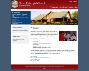
Christ Episcopal Church of Somers PointA few months ago one of my co-workers, the Admiral told me that her mom’s church was having issues updating their website: http://christchurchsomerspoint.org. Apparently the guy who developed and was assisting them with their site had gotten busy and was no longer able to support them in a timely manner. She asked if I’d be interested in working with them, and I said sure, why not.

My contact Mark came from a tech background. This really made explaining options a breeze and he had a very realistic expectation of what could be expected. He wanted to stick with the current site design and navigation with incorporating a modern CMS (content management system) so that they could manage the site’s content on their own.

After a short meeting and review, it became pretty apparent that Drupal would be a perfect fit for their CMS needs. I gave him a quick Drupal demo and he agreed as well. He was actually very much impressed and excited with what Drupal would offer them out of the box.

I also suggested that they try out Dreamhost for their hosting needs. Dreamhost offers free hosting for non-profits, and free is very hard to beat. I wasn’t sure if the free shared hosting plan would be good enough to support a Drupal site, but thus far it’s been great and looks to be a perfect fit for them.

The majority of their content needs were rather basic, but they did want the ability to upload and share mp3’s of their weekly sermons. Thankfully there were some great modules available that we were able to build upon.

Here’s a list of the modules used by their site:

  • audiofield
  • calendar
  • ctools
  • date
  • entity
  • file_entity
  • libraries
  • media
  • pathauto
  • token
  • views
  • views_slideshow
  • webform
  • wysiwyg

As you can see most are the standard site modules, but the audiofield was a new one to me and really solved the issue of uploading and playing mp3 files. It worked great.

I built the site on the Zen theme, which really made things easy to get started. Just chunked up their existing site into regions and blocks and styled things up from there.

After meeting with them to train them on using Drupal to manage their site, they were extremely pleased and enthusiastic to get started. It really felt great to know that I was able to deliver such and excellent solution for them at a very affordable price. I’m really glad I took on this project and can’t wait to see how well they do keeping content up to date.